This page is designed for English as a second language (ESL). Our school is the Bogotá Language Lab, and is the «Business English» and «Academic» branch of Legal English Innovation SAS.
Contact Us for private coaching today! We can help you.
Welcome!
This page will be a review of the business success stories business English module. The goal of the activity below will be to describe all five charts and graphs, using clear concise language.
Click here to see the vocabulary summary review list.
Tips:
Remember to introduce yourself, and sound enthusiastic mean while thinking about the mission ahead.
Use a strategy to buy some time and think about your words.
«For those of you who don’t know me my name is Eric and I would like to get started with my presentation tonight. I have broken the topics into five distinct areas. This will just take me a few minutes, so if any of you have any questions please hold them till the end and let’s get started.»
Tips:
On basic charts & graphs, orient the audience with the title, what they see on the left-hand side, and as they can see across the bottom.
Break the information into 2 or 3 parts. If they have any questions or comments, they can feel free to ask.
Most members of the audience already have an idea about the chart, you just need to be a nice host.
Tips:
This type of chart can help show milestones over the course of several decades.
Choosing the most important points to elaborate on our key to keeping customer engagement.
This is a simple chart, so be sure to have a strong introduction body and conclusion in order to keep your message clear.
Tips:
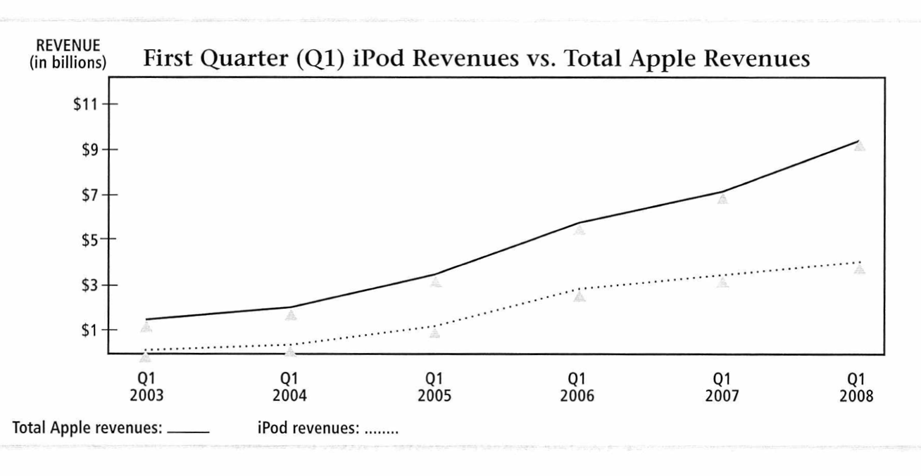
Often times you need to use comparative language, as in this case; one product versus overall revenue.
Dividing the charts into parts early years in late years can be helpful to keep the information simplified.
Also it is helpful to choose one of the product lines to focus on, and use the second as a complement.
Tips:
On basic charts & graphs, orient the audience with the title, what they see on the left-hand side, and as they can see across the bottom.
Break the information into 2 or 3 parts. If they have any questions or comments, they can feel free to ask.
Most members of the audience already have an idea about the chart, you just need to be a nice host.
Tips:
As with basic charts, on more complicated charts and graphs you need to orientate the reader about the chart.
The title could be very specific, as in this case a «year-on-year production change».
In the introduction be sure to break down column by column and remember you’ll have more time to explain and go into depth later.
Need help with Word, Excel or Powerpoint?
Free Evaluations
Excellent services. Impartial results.
Contact us for free evaluations and testing services. Risk free. Quality guaranteed.


